I apologize for not getting this post up last Friday as planned. We were at the lake and I forgot my power cord. This room had many problems. I wasn’t sure if it was possible to make it workable. Originally the space was to be one big room but as I pointed out in Part 1 here we opted to carve out a small bath that was accessible from the pool. That proved to serve us well for many years while the kids were growing up. This left us with an L shaped space. Please excuse the unprofessional sketch

The main part of the space was taken up with this giant pool table.

Here is a shot from Colin and Lauren’s wedding where the room was used as a staging area for the caterers to give you an idea. This room was done during the height of the southwest era note the glazed walls and Santa Fe green trim (ughhhh!!) This room never really looked very good so we don’t have many pictures of it.

Here is the same view now

Problem #1 The biggest problem and the biggest asset were the deep sills on the windows and lack of wall space. What I did was create the illusion of larger windows. For instance here; the window ends where the curtain panel starts.

Without the panel the sofa would be off center (which it is). Yvonne from Soft Accents made all of the curtain panels. They are made of inexpensive linen to save $$$.

Problem #2 On the other side we had the same problem. I needed a very small loveseat that would not encroach no more than half way into the French doors so we could still use the doors. My biggest expense in this room were the custom made sofas. I had my “ace” upholstery guy Fred make them. They needed to be low and precisely the right size.

I added the curtain panel behind the loveseat to hide the fact that there is a space between the French doors and the windows

Problem #3 There was very little space on the opposite side of the coffee table for chairs. I really wanted the chairs for extra seating. I had these Lee Industries small club chairs that I had done for a client years ago. The coffee table is from Artesia Collections.

They could no longer use them so “the hoarder” shoved them in her garage. I had them recovered with indoor/outdoor stripe fabric from Perennials. The African Indigo pillows are by Nancy Ann Designs on Etsy here The sofas are also upholstered in Perennials Rough and Rowdy Paper Bag indoor/outdoor fabric. The brown pillow is Peter Dunham Kashmir Paisley, the blue is Peter Dunham Ikat, and the brown is Leopard Sand by Ralph Lauren . Yvonne from Soft Accents made them. The blue Japanese Shibori pillows are from the Homegirl Collection on Etsy here. The rug is from Home Decorators Collection here. Beau rolls and digs at rugs so we have rolled up and put away any nice rugs that we own.

This was the wall arrangement when you entered on the left. Once the curtain panels were added there was not nearly the space. The ottomans from the Lee Industries Chairs were refurbished. The skirts were removed, I stained the legs, Fred recovered them in this Ralph Lauren Leopard fabric, and added the nail heads for interest. They are tucked under a pair of Vintage Shutters from Patine here. Dani has similar ones off and on.

Right around the corner to the right was this. Steve built the built in when we moved into the house and it worked well for the TV for years.

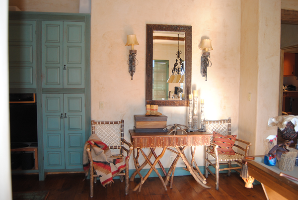
Here is what this area looks like now. The TV is housed behind the vintage shutters. I had Katie of Katie Baker Slipcovers make new covers (out of the stripe perennial fabric) to lighten them up and Dekowe (from Etsy) made the Peter Dunham pillows. The twig table was made years ago by a local artisan and I couldn’t bring myself to part with it even though I was afraid it might not work. The chairs are from Old Hickory and are probably 20 years old as well. It took some thinking but I am glad I didn’t get rid of them. Don’t be afraid to mix things up everything doesn’t need to be the same style or from the same period.

Steve made the TV Cabinet out of old fence boards, ply board (back) and a set of vintage shutters. I will do a tutorial on that at a later date.
This was the sectional set up that faced the TV. It was a dark little corner as you can see.

We converted this area into a small eating area. We eat here nearly every night. The table was my mom’s. It is not a great table but I wanted to save something from her house and it was just the right size. Steve painted the base with Amy Howard One Step Paint in Windsor so it would just disappear. Lantern is from Noir. Curtains by Yvonne from Soft Accents. Painting by Carmel painter Chris Johnson. Hunter Douglas Provenance Shades.

The chairs are from Artesia Collection. The cushions are covered in Perennials Indoor Outdoor Ishi in Chai. The pillow is Zak and Fox from Dekowe on Etsy. The rug is jute from Ballard Designs here
The cabinet which is behind the table and chairs was painted that same awful green. Steve repainted it in Amy Howard One Step paint in java. It is a nice taupe that kind of blends with everything.

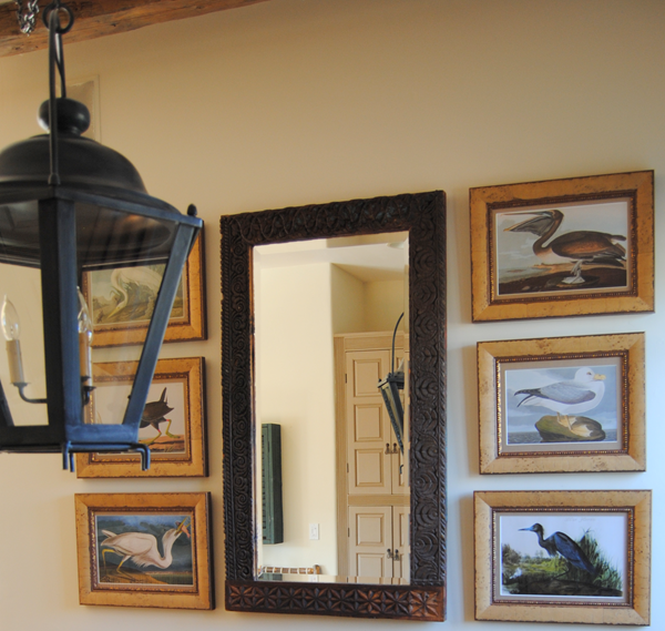
On the wall above the original sectional was this arrangement.

These pictures were just reproductions from Art.com and had become faded from many years next to the window. Check out the color of the buffalo. The frames were nice and I wanted to save them. I selected new reproduction prints from Art.com in colors brighter and more fitting for the room, had them rematted at Artistic Hangups and we reframed them. Note they aren’t perfect. The mirror I have had for years. It hung in the spot where the TV is now.


Last but not least… The wall to the left of the bathroom door is where the pool cues hung . Here I placed two of my favorite paintings by my friend artist Pat Huber. I can see them every night when I perch on the sofa and they make me happy.

This room was the most underused room in the house with the most potential. The windows and french doors look out onto the pool and garden area with a view of the surrounding hills. The prettiest view of the entire house. The room also has old beams from a Pennsylvania barn and hand hewn wood floors. Here are the before and afters.


If I forgot any sources or you have any questions please comment below. We are loving our new space. I hope you like it too.

Wow, what a fabulous transformation. I love it all.
ReplyDeleteThank you so much Marty I really appreciate that.
DeleteSpectacular. I want to cozy up there and gaze at Pat's paintings. Really lovely job, Cindy!!! Thanks for your sources, too!
ReplyDeleteMy sources are your sources!! Ha!! Pat's paintings rock my world I will tell you that!!
DeleteOf course I LOVE it!
ReplyDeleteThanks Kim! I love your house as you know!!
Deletegorgeous! just gorgeous! i'm loving your new space Cindy!
ReplyDeleteThanks Nancy..you need to come visit!!
DeleteThe transformation is warm, inviting and appointed. Lovely
ReplyDeleteThanks Rie we love it!
DeleteGreat transformation, and I love that you have shown how the curtains have made the sofa work so that it doesn't look off centre at all, very clever.
ReplyDeleteCurtain panels can make magic when you need them!!
DeleteLove the complete transformation. You were in the midst of working your magic when we were there. This is lovely. I particularly like how you 'housed' the tv! The view from that room is captivating and you've allowed it to take a prominent place.
ReplyDeleteThanks Cheryl...we sure love it and can't wait for you to come back!!
DeleteCindy,
ReplyDeleteWow! I love what you've done. This space is inviting and charming. I love it. Great ideas, thank you.
xo,
Karen
Thanks for the kind words Karen
DeleteWell, both our husbands had put The TV behind SHUTTERS..............interesting!
ReplyDeleteUNFORTUNATELY,my husband went out and BOUGHT A BIGGER TV and that did not work anymore!SO, the stereo is hidden away.............NOW!
The first thing I noticed was the VIEWS..............BEAUTIFUl.
The whole room looks COZY and RELAXING..........NO CLUTTER!!!
As you know THAT would be hard for me to pull OFF!!!!!!!!!!!
I'm BACK!!!!!!
XX
I have certainly had my moments of clutter Elizabeth...you will never see any photos of my office!! Glad you are back I will give you a call can't wait to hear more about your trip
DeleteI believe in the power of curtains/fabric to make magic out of difficult spaces. Your new space is a deep comfort zone. We all need spaces in our homes where we can feel happy just by being there. Great job...as for leaving your cord at home while at the lake...brilliant! Lake therapy at its finest: unplugged.
ReplyDeleteYes the curtains did their magic here! And you are right...it was good I left it!!
DeleteYou have really worked your magic and made this space so warm and inviting. Your style is impeccable and I love every detail! One word...FABULOUS! And thanks for sharing sources you used!
ReplyDeleteThank you so much Gail, we sure enjoy our new space.
DeleteThis is hilarious, best example of WHY HIRE AN EXPERT !!!!
ReplyDeleteMore than new room, looks like a new home.
Garden & Be Well, XOT
Thank you so much Tara!!
DeleteThanks Karolyn!
ReplyDeleteI agree with Tara. Fantastic!
ReplyDeleteoh, cindy! I read every single word and am knocked out by the way you tackled this beautiful makeover with customized everything--all the warmth and textural goodness just invites you to settle in. and your view! this little fairy wouldn't know what to do with such glorious mountain lovely just outside the window. thanks for sharing all your sources and how-tos. one of my favorite details is the vintage shutters hiding the TV. I think you have successfully camouflaged it better than anyone because those shutters look completely natural and as if they are art on the wall. bravo, sister! xox
ReplyDelete