Welcome to the latest edition of our Project Design Series. Mary Ann (Classic Casual Home) and I really enjoy these simple projects because they encourage us to look at our own homes with a fresh eye.

Do you feel like something’s not quite right about your entryway? Maybe it’s hard to see your front door, or it feels bland and uninviting. Whether you’ve recently moved in or have been settled for many years, the entry can often be an overlooked space particularly if it is small. How do you make it more welcoming? It is the first thing guests see so make it matter. If it is small a mirror can create the illusion of more space. Try something you might not try in other areas of your home. Bring in some bold artwork or wallpaper.
Try these simple tips:
For those of you new to my blog, we have lived in the same house for over 30 years. Our front door rarely gets used so my entry was definitely in need of some love. We are very fortunate to have a great entry. The ceilings are 24 feet high which can be a blessing or a curse (depending on how you look at it). The hallway above has massive beams and the entry itself has a very large hand forged iron light fixture. Furniture pieces need to live large even though the actual footprint of the entry is small.

There is a niche below the stairway when you enter. For years it looked like this. This little Brazilian chest just fit in the opening but it always seemed to small. It looked pretty good when our walls were glazed.

When we painted our walls white and our windows dark (about 2 years ago), the chest just didn’t work anymore. You can read about that transformation here. A couple of months ago I spotted this English Wicker Travelling Truck in a local antique store. It was just what I was looking for. I knew it was going to be close but I prayed it would fit in this spot. It wasn’t much wider but deeper which created the illusion of more mass.
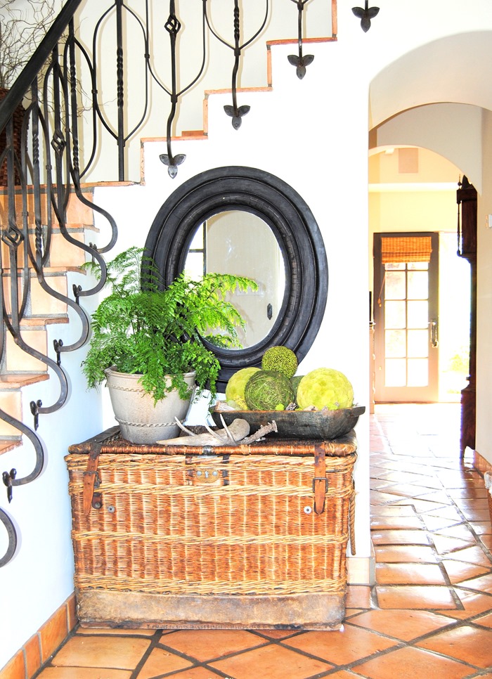
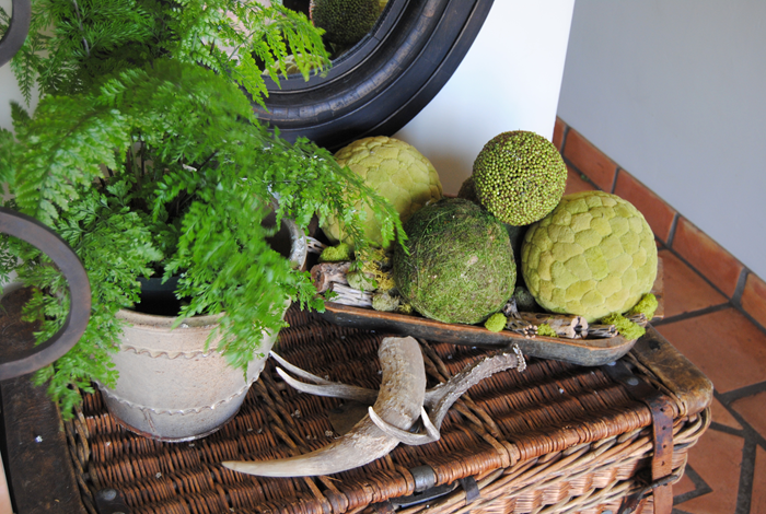
Here is the entry now with the travelling trunk in place. I wanted the whole area to be brighter, more textural, with a pop of color. A fresh green is just what it needed. I brought the black mirror down from the guest bedroom to hang above the trunk. All of the other elements were things I already had. Shop your home before you buy something new.


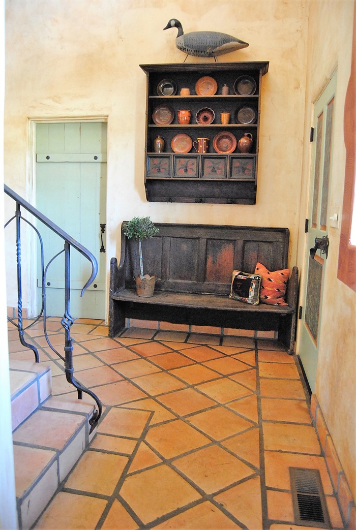
To the right when you walk in the door I still have the same two pieces I have had for years. We bought this late 1700’s English Bench over 20 years ago. It fits perfectly in the spot next to the door and is a great place for guests to park their stuff. The shelf is a Mexican reproduction. I like it because it has hooks so guests can hang their coats. We do not have an official entry closet.

I decided to use green for a pop of color. I got rid of the drawers and filled in the areas where the drawers are with old Bobbsey Twins books (they just happened to be the right shade of green) , natural elements and a Bulgarian bowl I found when we were up in Napa last weekend. I added new pillows to the bench and a great new rug.


The green pillow came from pillowme on Etsy. The striped pillow on the left came from a great new source the kilim pillow store. and the cowie shell pillow was found here I am a huge fan of Etsy and their purveyors.

On the wall going up the stairs calendar prints (from old cavallini calendars) have resided for at least 15 years. The ones on the left side began to fade due to their proximity to the window. I have never tired of the basic arrangement. I think it works well in that area.

I ordered new (old) antique botanicals from Ebay and had my buddy Butch from Peninsula Arts and Crafts do french mats for them.I kept the original frames.but darkened them with a little ebony briwax to perk them up a bit .The result is fresher and more up to date.

I originally painted my front door green, marbelized the panels and comb grained the recesses. When we painted the windows dark I painted the base of the door black and left the comb grained recesses for interest.

I brought the antique chair from a bedroom upstairs and added a graphic pillow to give it a more current look. The rug is an overdyed Oushak. You can find them in every color imaginable here
 Stop by and see what these talented ladies have done to update their entryways. I am sure they will inspire you!


i love the updated walls, and that trunk is just so perfect there- it suits your home well! thank you so much for organizing this and including me!
ReplyDeleteThank you so much for inviting me to the tour. I love all of the pieces in your entry and I adore the stories behind when and how you found them!
ReplyDeleteWhat a wonderful entry Cindy, i really enjoyed seeing the before and after photos with all the Etsy sources, thanks for that. I have no real entry. It's the opposite of my previous home, my door literally opens up and barely misses the first step of our stairway. It's the oddest thing. Hard to minimize a staircase haha but I keep trying. Thanks for this series, it's so inspiring.
ReplyDeletexo
Leslie
Gorgeous foyer, I love that Spanish tile and the staircase ...drooling!
ReplyDeleteThank you Christine! I wish I had stained the tiles dark many years ago but we are living with them as is. I appreciate the love!!
DeleteWOW... the art, all the meaningful elements. I love your style, Cindy, warmth with age and a fresh outlook. The straw hat and basket with lemon branches (amazing) and denim jacket!!!
ReplyDeleteYour tips are perfect and I especially like the "experiment" tip...which seems obvious but it isn't to everyone.
I want to see the art in person. Thanks for the Etsy sources. Thanks for doing this again with me, buddy!
Cindy.... I LOVE your house. Is it wrong to say that I love the before AND after? Have a great weekend.
ReplyDeleteThanks Katie! I loved it that way for many years. I have just been attempting to update the old homestead because we do plan to sell at some point. I am so happy you like both versions!!
DeleteFabulous is the word that comes to mind when looking at your entry. There are so many wonderful textures and elements to look at and yet there is a beautiful visual flow. Lightening the walls made such a difference, bright, fresh, warm and welcoming. Love your floors!!
ReplyDeleteThank you so much Kathy Sue. I consider that such a compliment coming from you!
DeleteLove your entry Cindy! I'm especially jealous of the beautiful iron work throughout your house. So special and well thought out. Wicker trunks are my weakness too....along with about a million other things : )))
ReplyDeleteHey, Cindy...everything looks great and I really enjoyed the before and after. I'm with Katie: I like the before and the after. I have to say I'm in love with that trunk...! :) (@figandscallion)
ReplyDeleteI LOVE it too Karen. I searched for a good one for a long time and was thrilled when I found this one at a great price to boot!!
DeleteLove the green ikat pillow on the bench. Etsy says it's 16 x 26. Is yours that size?
ReplyDeleteThank you, Jan
Hi Jan! Yes it is!
DeleteWhat a fabulous entry, but then I knew it would be! I absolutely love the wicker trunk, it looks perfect there, and of course I adore the English bench, in English it is called a Settle and was made with the high back to protect against draughts when sitting! We used to have one in our farmhouse when I was growing up, and surprise surprise it was in the hallway, no one every sat on it except to put on shoes!! This was such a fun project to take part in, thank you so much x
ReplyDeleteHi Susan
DeleteWe have collected antiques for over 40 years. We started our (primarily american) collection while still in college. I was afraid to call it a settle for fear no one would know what I was talking about! I am glad you chimed in! Thanks so much for joining us. Your lovely home added so much!
Cindy, Love your house. I am crazy about your gorgeous staircase and floors and the doors. It looks terrific with the updates. I think the pop of black and white with the natural elements makes it seem fresh. I'm so glad you didn't change too much. The wicker trunk was a great find too and the mirror is great with it. I agree that you can update without buying a thing if you shop your own home, which I also did!
ReplyDeleteThanks so much for asking me to be part of this fun challenge. I am so glad I did as I would have never done this if I didn't have a time table! Now I have a whole new entry and it feels great. Was lovely getting to know the other bloggers as well. Loved this experience Cindy! Kim
Cindy,
ReplyDeleteAs you know now, I am IN LOVE with that traveling trunk! I seriously can not get it out of my head since I saw it on your Instagram post this morning! Gorgeous! I love the texture and it's absolutely perfect in that spot. I also love your pops of green and your Etsy pillows. I love Etsy! I've found so many great vintage pieces on that site too. And lastly, I'm a huge fan of botanicals and I just love that you updated them so perfectly. You used the same idea, but gave it a fresh feel. Love it!
Thank you again for including me! I've had so much fun "hopping" with you all:)
Sheila
xo
I love Project Design for the very reason you mention. I think this particular project is especially welcome. Entry areas can get into a rut since we all seem to focus change on the larger living spaces in our homes. You've done a wonderful job---love, love that English wicker hamper!
ReplyDeleteI'm off to visit the other talented ladies, thanks to you and Mary Ann for hosting these tours.
xo,
Karen
I love your entry Cindy! That staircase is so beautiful! Love the trunk and pops of green with the pillow and plant. Enjoyed joining you all in this series!!
ReplyDeleteyou are A M A Z I N G cindy! adore the refresh, i would want to put a lazy boy in there to sit, linger and admire, not really sitting on the floor would do.
ReplyDeletexoxo
Thanks Pal!!
DeleteTHS LOOKS FANTASTIC!!! What a great job and such a fresh transformation!! so fun to see everyone's reveal!
ReplyDeleteThanks Leslie!
Delete" Shop your home before you buy something new."
ReplyDeleteI LOVE THAT LINE!
Is that a flying PIG...........I have the same but a BUNNY as a Christmas tree ornament!
LOVE the OLD BASKET........THe Mexican tiles.............latch on the door.
THE HAT!!!!!!!!!
I Hope to saunder in THAT door ONE DAY SOON!
XX
So much character and warmth, Cindy! you girls are inspiring me to give my entry some love--it is not yet ready for its closeup. Loving the rustic touches and all the texture in your beautiful home. xox
ReplyDeleteI love what you have done. I have a home that is very similar in styling. My walls are venetian plaster and are soft taupe in color. Were your walls venetian plaster before you painted them white? If so, did you use a white paint, or did you need to change the color with a tinted plaster?
ReplyDeleteCindy, I simply adore your iron stair rails! What a magnificent way to greet people entering your home. They are so unique, unlike any I've seen. And I love how you added the vignette of botanicals on the stairway wall. That is something I've wanted to do for a long time and have kept an eye out online for a set of them. Lucky you for scoring big in that department.
ReplyDeleteSo nice, Cindy! I love how you freshened up your space. The wicker trunk is perfect. Love the white paint too. Beautiful job!
ReplyDeleteIndeed, a welcoming space. I agree with others that I like both the before and afters. Nice to see another calendar girl fan. I have loved Cavallini's prints for decades. Your new French mats add a nice defining touch. One of favorite collection of flowers fit perfectly into Target frames (that came complete with crisp white double mats). A little time, a little SprayMount to hold the prints in place and instant-chango: looks good on my walls...and on my wallet. And don't get me started about the wonderful uses of ebony bri-wax! As my late MIL would say, "covers a world of sins!" And since I have inherited some of her sins, I continue the wax on/wax off routine.
ReplyDeleteWhat a good, beautiful and dramatic change. LOVE what you did. And, yep, sometimes just moving things around can be quite a change. We get used to the same old, same old...so when we move it we're in love again.
ReplyDeleteGood job !!